Building and Deploying A Dashboard in Python
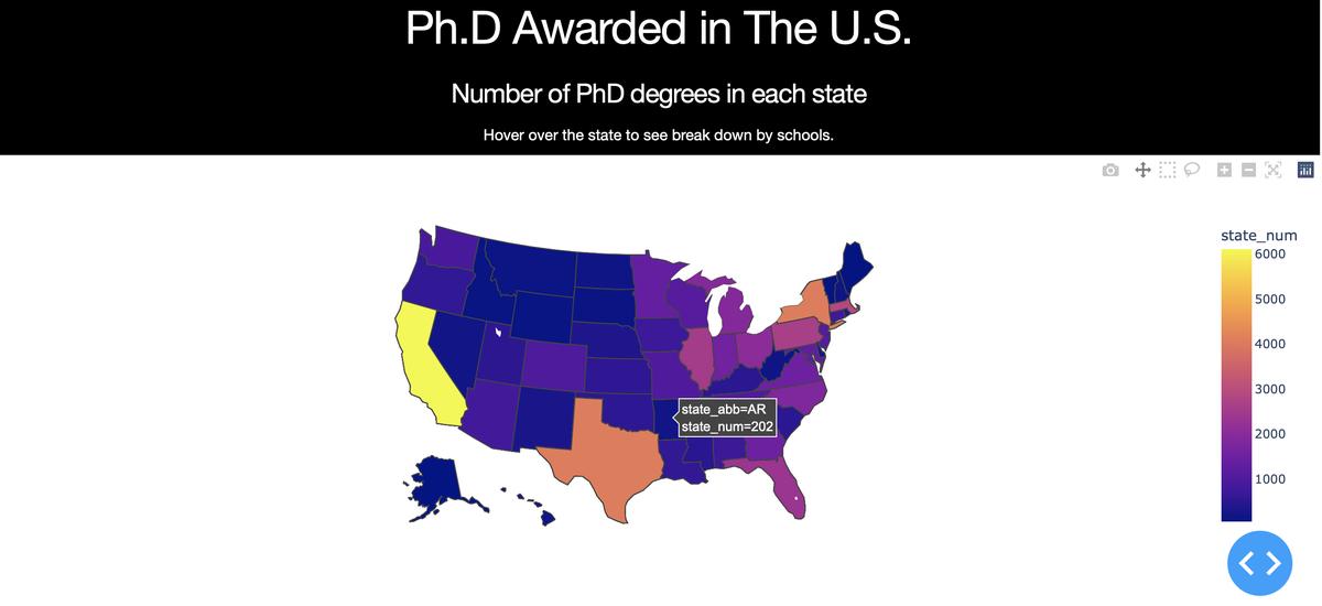 Image credit: Github
In this post, I will demonstrate how to build a dashboard like this in Python. The data visualization software I use is plotly. I also use dash for building the dashboard app. For deploying the dashboard, I use Heroku which is a cloud platform that can host the dashboard for free.
plotly: building graphicsdash: building the dashboard- Heroku: deploying and hosting the dashboard
The data I use is the number of PhDs awarded in the U.S.. The data set I download is the 7th table “Doctorate-granting institutions, by state or location and major science and engineering fields of study: 2017”.
Data Cleaning
After looking at the data, I decide to build a dashboard that shows the number of PhDs awarded in the U.S. in 2017 by state, then a user can see a more detailed breakdown by universities in a given state when hovering the mouse on that state. In order to do that I need to clean the original dataset so that the data contains 4 variables: university, state, the number of PhDs awarded in the state, and the number of PhD awarded at a university.
After cleaning the data into the format that I need, I save the cleaned data file so I can easily use it when building the dashboard.
Dashboard Building
Now, to build the dashboard we need to first download the required packages:
conda install plotly
conda install dash
Three elements that are needed in order to build an interactive dashboard with dash:
- html components
- dash core components
callback
The html components are needed to build the layout of the app. The dash core components are the elements of the dashboard, such as the graphs, dropdown menus, and sliders. Finanly, in order to make the dashboard interactive, we need to a decorator function called callback that can dynamically change the output graphs depending on the inputs an end-user chooses.
Let’s first make the overall layout of our dashboard by using html components. The first element we need is html.Div(). It is a Div component, which is a wrapper for the <div> HTML5 element. We can think of it as a container for whatever content we want to put in, such as a slider, a paragraph of text, or a graph. Inside the first Div, we can have html.H1 or html.P components to include the title or write some text.
Since we want two graphs in the dashboard, we need to add two “placeholders” for these two graphs. This is done by add dash core components (dcc.Graph()). It is imperative that we include a unique id for the each graph. The id argument is like a variable name when we are programming in Python, so that we can refer to the exact graph we want later.
Since we would like interactivity that can dynamically generate plots based on where the user is hovering the mouse, we can add that functionality in dcc.Graph() by adding the argument hoverData={'points':[{'location':'CA'}]}. CA here is added as the baseline case.
Here is the code for the layout I have.
app.layout = html.Div([
    html.H1("Ph.D Awarded in The U.S.",
    style={'text-align': 'center', 'color': 'white'}
    ),
    html.Div(id="app-container", children=[html.Div(
        id='heatmap-container', children=[
        html.H4("Number of PhD degrees in each state",
        style={'text-align': 'center', 'color': 'white'}
        ),
        html.P(
            "Hover over the state to see break down by schools.",
            style={'text-align': 'center', 'color': 'white'}
            ),
        dcc.Graph(
            id="state-choropleth", figure={}, hoverData={'points':[{'location':'CA'}]}
            ),
        html.H4(
            "Number of PhD by Universities",
            style={'text-align': 'center', 'color': 'white'}
            ),
        dcc.Graph(
            id="selected-data", figure={})
            ])
            ])
            ],
            style={'backgroundColor':'black'}
            )
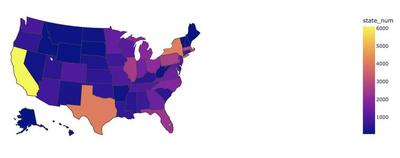
Moving on to the making the plots, we will be making a choropleth map and a bar graph. This is fairly easy to do with plotly express.
import plotly.express as px
px.choropleth(df, locations="state_abb", locationmode="USA-states", color="state_num", scope="usa")
-
df: the dataframe we are plotting -
locations="state_abb": there is a column in the dataframe called “state_abb” that specifies the state name abbreviations -
color="state_num": there is a columns in the dataframe called “state_num” that specifies the number of PhDs in a state -
locationmode="USA-states": tells Plotly that we are working with US state level data -
scope="usa": tells Plotly to only make a map of the U.S.
This should give you a choropleth map like this:
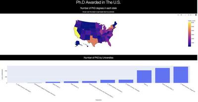
The next step is to make a bar plot of how many PhDs universities in a given state give out. We want to make it interactive so that an end-user can specify a state by hovering over the state he/she is interested in. This is where callback comes in.
As mentioned previously, callback is a decorator function that allows the input and output of a function to change dynamically depending on where the user is hovering. To use it, we can specify the input and output in the parameters. The component_id refers to id in the html components. The component_property refers to the type of objects. It is usually a parameter in the html components.
@app.callback(
    Output(component_id='selected-data', component_property='figure'),
    [Input(component_id='state-choropleth', component_property='hoverData')]
)
After building out the callback() function, it’s time to wrap it around a function that generates bar plots. Here is the code:
@app.callback(
    Output(component_id='selected-data', component_property='figure'),
    [Input(component_id='state-choropleth', component_property='hoverData')]
)
def update_graph(hoverData):
    ''' Make the bar plot '''
    dff = df[df.state_abb == hoverData['points'][0]['location']].sort_values(by='num_institution')
    fig = px.bar(dff, x='insitution', y='num_institution')
    return fig
This should give you a bar plot that can update as you hovering over different states.
And… here we go! We have all the components needed to make the dashboard. Please refer to this page for the entire script.
When you run the script, it should generate a dashboard like below that is hosted on localhost.
Deploying
Now, we are ready to deploy this dashboard for everyone to see! There are many options to deploy this data app. However, they might cost some money to host the app. Since I don’t really want to spend any money on this, I found Heroku – a cloud platform that can host my app for free!
Hosting the dashboard on Heroku is relatively straightforward. We need to first register an account on Heroku. Then we need download the Heroku CLI. Finanly, we can follow the instructions here to deploy the app.
After completing these steps, the dashboard should be deployed on Heroku now. Check out the dashboard here!
Please refer to the complete code on Github!